
BALENTS
Rebranding Design Concept
ROLE: Designer, Packaging Designer
Design Team: Jon Beavers, Adriana Cushenberry, Sarah Hernandez, Chez Johnson, Reneé Lynn, Keenan Mack, Sydney Tucker
Bringing a new voice to a Black-owned medical billing company based in Atlanta.
In a collaboration with Matchstic, our team tackled the rebranding of Balents, a Black-owned, medical billing company that works as a third party vendor to provide certified billers and coders dedicated to each practice they serve.
Our aim was to create a visual brand that would set the Balents brand apart from local competitors. Creating graphics that feel personal to the Balents corporate brand that cannot be replicated, boosting brand recognition amongst clients is ideal. We would like to effectively communicate how unique Balents is to this industry as well as give an attractive new look that will generate an increase in clientele and create loyalty amongst them. Adding more personality to the brand identity will help produce these results. When people feel like they’re interacting with others opposed to software, it feels more personable. Since Balents does a measure of services, it would be useful to communicate this through tone and voice.
THE OLD
THE GOAL
Create an identity that will communicate a professional yet approachable medical billing company.
KEYWORDS
Balance
Trustworthy
Stability
THE MOODBOARD

Logo Design by Chez Johnson.

PACKAGING DESIGNS
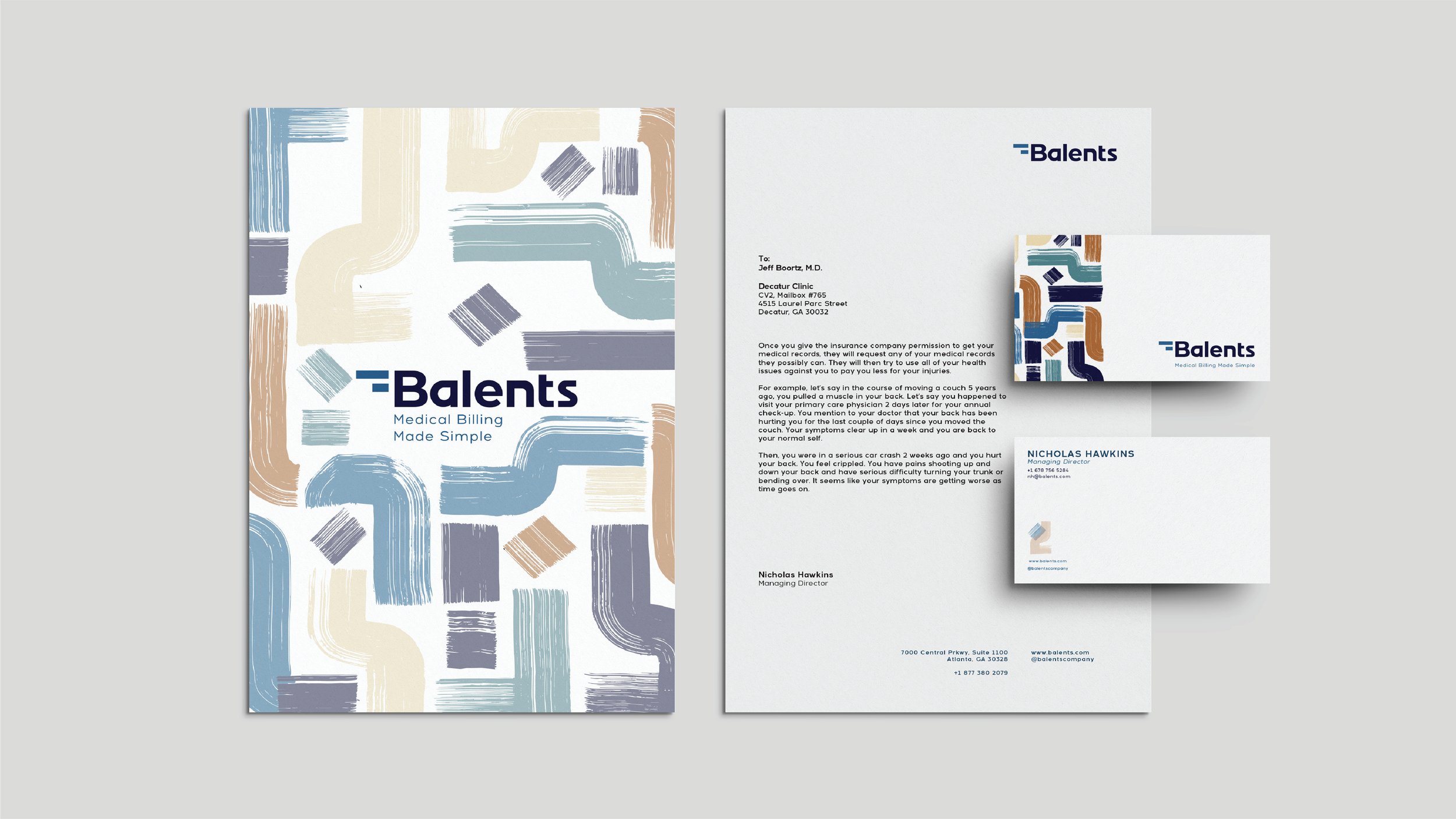
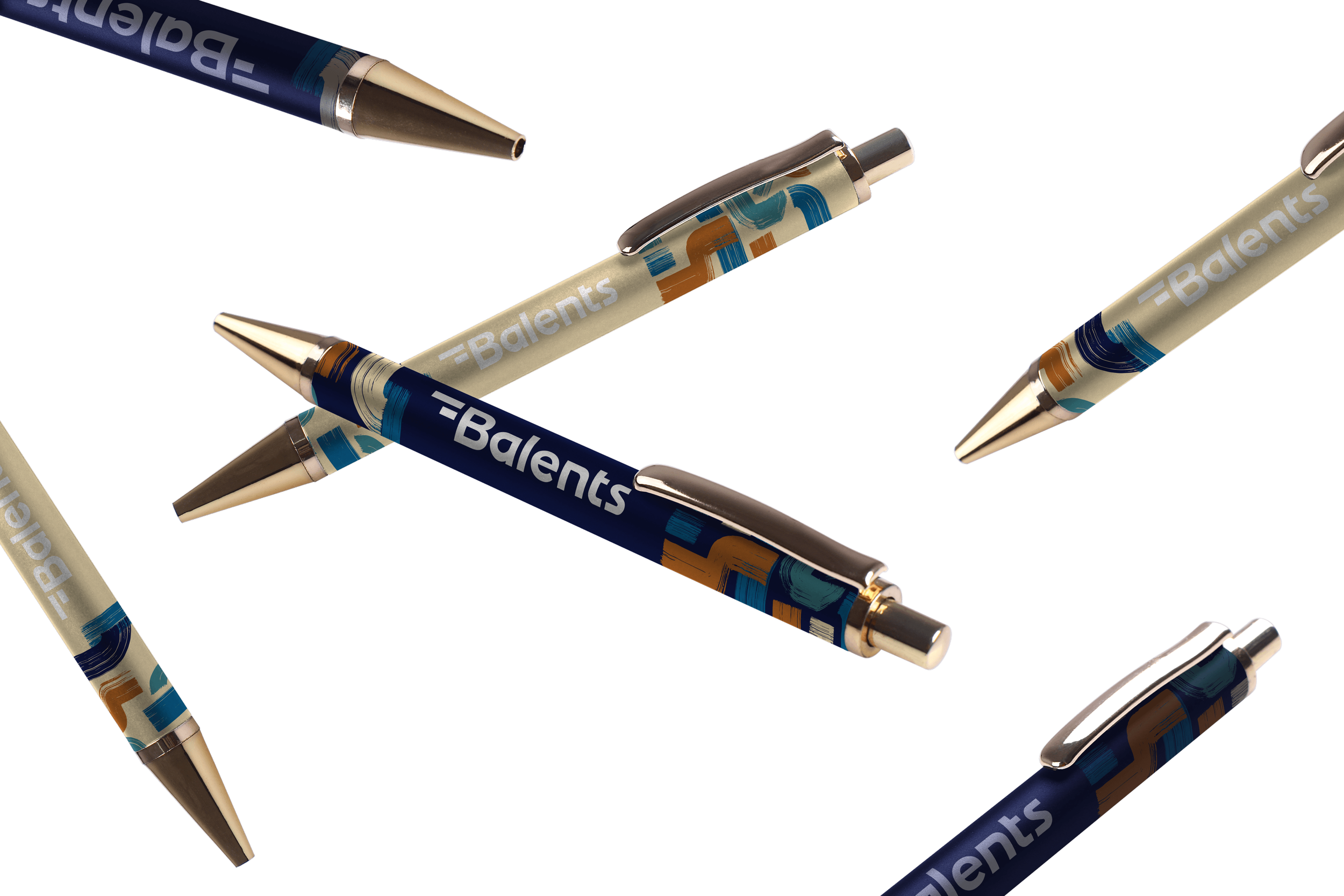
Our client wanted to revamp the designs that potential and returning clients would be seeing, whether it be at a medical event or in the mail for their five year anniversary appreciation box with Balents.
The client selected my design approach for the overall packaging, signage, and uniform. I led the team with the goal in mind that all of the designs would be applied to create something that would excite the clients upon opening.
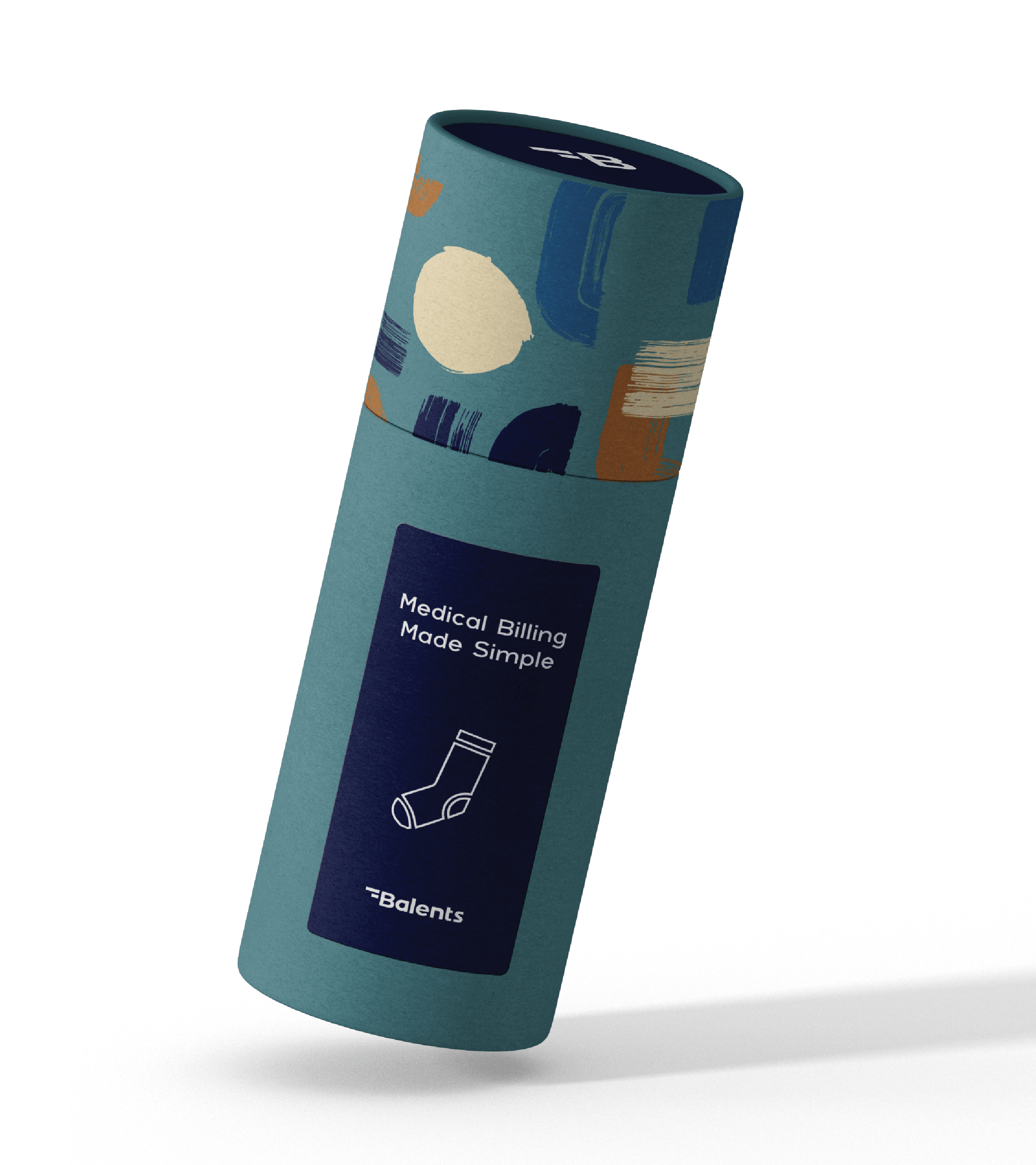
Sock tube designed for handing out at events but also to be included in anniversary package. Package design by Sydney Tucker.
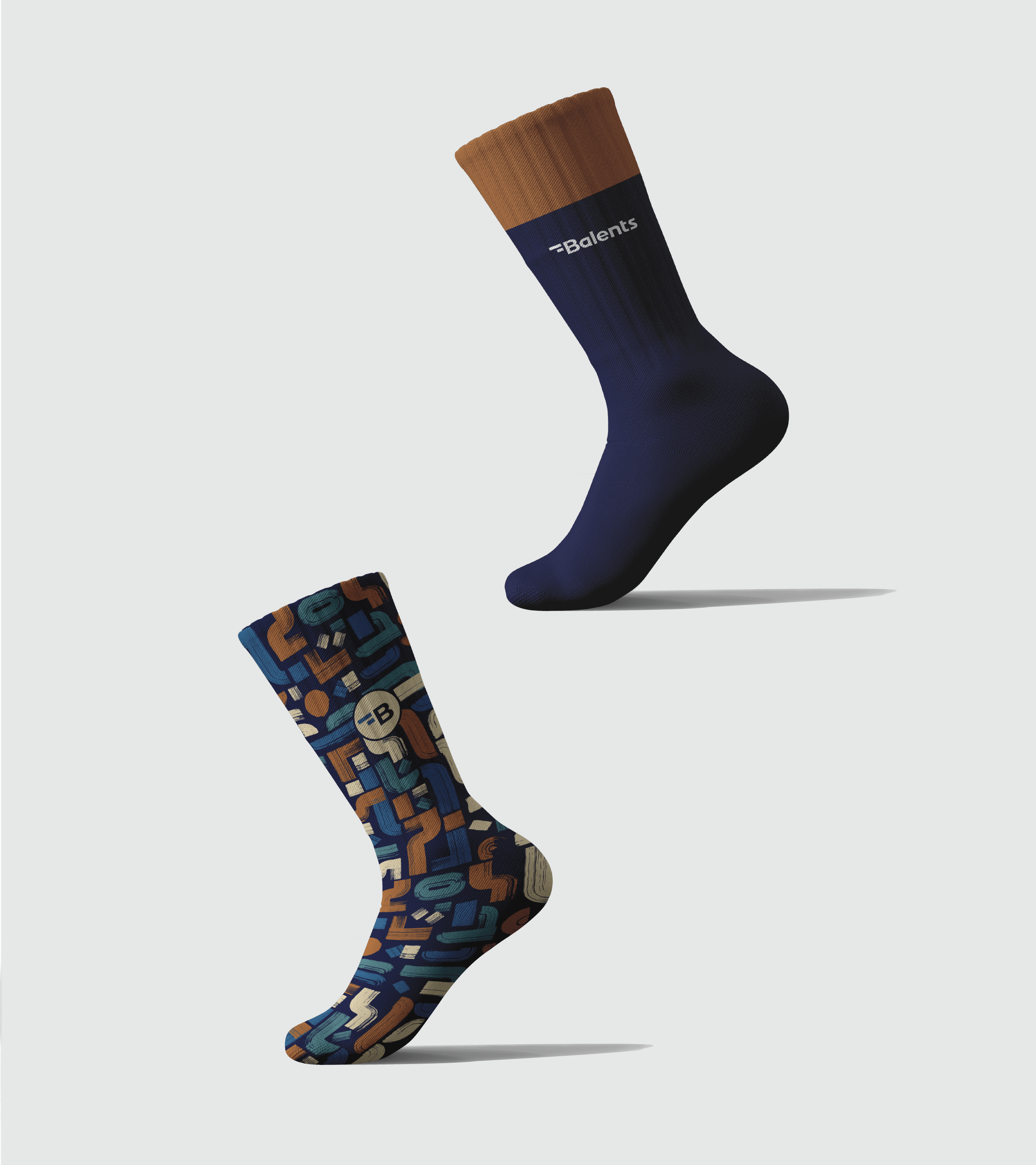
Sock designs by Keenan Mack.
ADDITIONAL PACKAGING
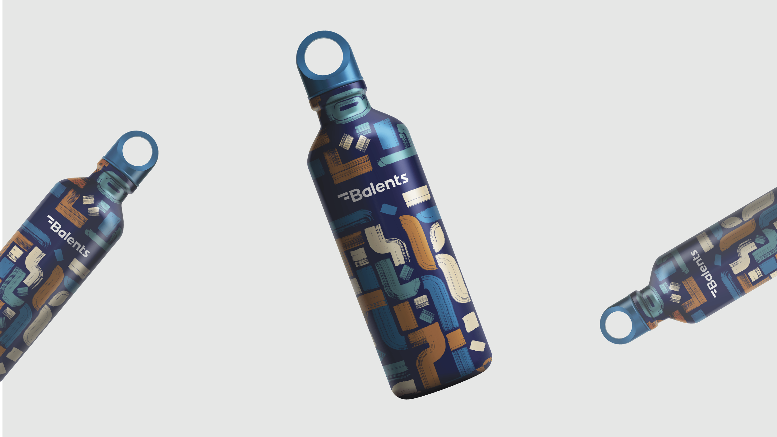
These designs were created to push the brand further and connect to the clients in a more out-of-the-box yet relevant way.
Alternate prescription bottle label.
I wanted the client to stand out at different medical events and thought what better way to do that than with a prescription bottle created to replace a business card. The label houses all of the information needed to get into contact with Balents and inside would be different treats for potential clients. Treats like chocolate, mints, & gummies.


